The world of optimization and usability is not very hospitable. You always have to deal with abbreviations and words incomprehensible out of context.
UX, UI, UCD? Are these the names of some indie-rock bands? We decided to collect a mini-dictionary of terms that will be useful on your way to customer orientation.
Usability
Usability is what we are here for. It is the ease of using your product or website. Good usability allows users to achieve goals without any boundaries. Read, find or buy what you were looking for in a few clicks.
Usability often echoes UX – one is impossible without the other.
User Experience (UX)
The user experience is a subjective feeling. The client receives it using the website or service. Accessibility, reliability, informational content, ease of use, relevance, etc. – UX consists of these criteria.
UI (User interface)
UI is the site or application interface the user interacts with. The more convenient and intuitive the UI, the better the usability and UX. If a random user sticks and wants to click on all the existing buttons, consider that you have won this battle.
Usability Engineering
As the name implies, these are all aspects related to usability development. And it's not about design in the classical sense. First, you need to create a user-friendly interface so that users can achieve their goals. Usability Engineering is also the correction of errors pointed out by customers.
HCI (Human-Computer Interaction)
HCI is a whole branch of science that studies the use of computers by humans. It's a mix of science, psychology, ergonomics, and sociology. The main goal is to bring the average user closer to new technologies.
IxD (Interaction Design)
Interaction Design also has nothing to do with the picture. The graphic designer is responsible for the visual component, but the interaction designer builds a dialogue between your users and the interface.
There are five "dimensions" of IxD:
- Words. The text on clickable buttons should be simple, expressive, and call for action. The information on the buttons is important, but don't overdo it because the user can feel pushed.
- Visual. Graphic elements, such as images, typography, and icons that the user interacts with. They often complement words.
- Physical objects or space. Through which device does the user interact with the product? If it's a laptop, is it with a mouse or a touchpad? Or is it a smartphone that uses gestures? And in what conditions is the person himself? Is he standing in a crowded subway or sitting at a desk in the office? All this affects the user interaction and the product in completely different ways.
- Time. This dimension refers to non–static content - animations, videos, sounds. Movement and sound, adjusted to user interactions with the site, elevate you to the level of God. But there is a fine line. In general, the media determines the time the user will spend on the site.
- Behavior. This dimension is about the mechanics of the product. How exactly do users perform actions on the site? It also includes the reaction of customers and their emotional assessment or feedback.
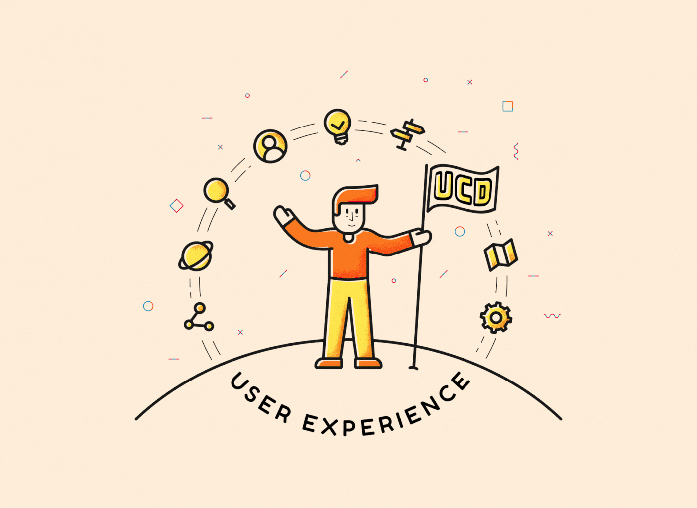
UCD (User-centered design)
UCD refers to the users' expectations, wants, and limitations analysis. Graphically such a design would look like a closed loop. On-site visitors should test each update. And this is a constant process.
Iterative design
And this is another loop, but in the design. You get a concept, create a prototype and test it on users. After that, you analyze the results and supplement the concept. The next iteration starts. The process may take forever, but in an ideal universe, sooner or later, users will be satisfied with EVERYTHING, and you will no longer have to add anything.
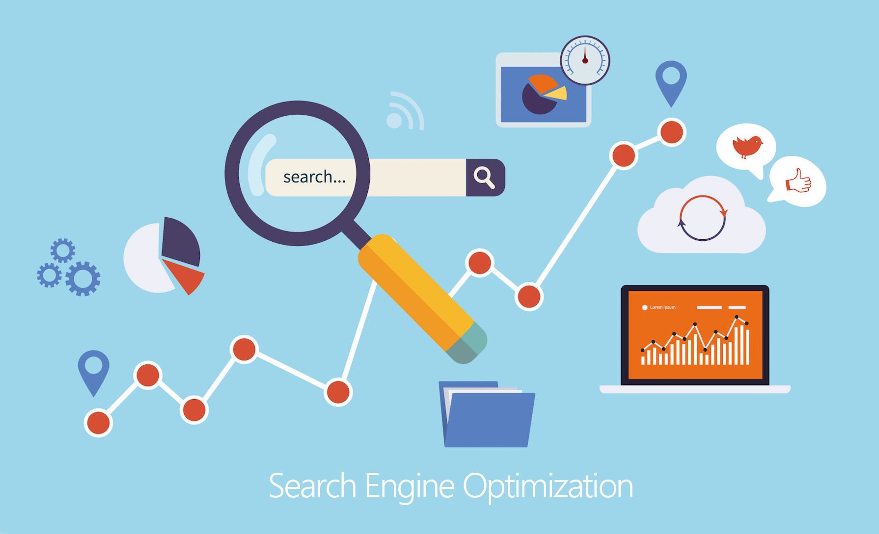
SEO (Search Engine Optimization)
There are three things one can watch forever – fire burning, water falling, and SEO being buried every year. But it is very much alive!
There are many ways to sell a service, information, or product on the Internet. But for them to work, you almost always need to be as high as possible in the search results. SEO helps to optimize the website. For example, create a copy of it to increase the chance of being found in the search.
Conversion
The conversion rate is the number of users who have performed the desired action on your site. Depending on what you offer, it may be registering a new account, purchasing, or requesting additional information. 100% conversion is a mythical beast, uncaged and unconquered.
A/B testing
A/B testing is a simple and effective way to test changes on the site. And find out how they affect the conversion. For example, you have two home pages – A and B. You show each of them to 50% of users. After that, you analyze which one works better. And understand which one should be left on the site.
User feedback
A great way to get an evaluation of a site or application, even if you haven't run A/B testing. With the help of tools like our platform, allow users to participate in surveys or leave feedback passively.
What could be more relevant than a look from the outside from those who use your site the most?
Five-second test
Usability test, in which the participant is shown the site page for only 5 seconds. And then, they answer simple perception questions, such as "Who is this site for?", "What can be done on it?" That's how the first impression is evaluated, and you understand how you have designed the site.
Card sorting
Card sorting is a test to improve site navigation. Participants are given lists in the form of cards (for example, it can be a list of all products that are sold in an online supermarket). Each participant groups them as logically as possible.
Sometimes the ability to give these groups names is added to such tests. So you also get an insider on potential site categories.
You can use different card sorting options:
1) Open. The participants group the cards as they like and name the groups to most accurately describe the content.
2) Closed. You create and name the categories yourself in advance. For example, you need to put the "Watches" page in the parent category, and you can't choose between "Accessories" and "Jewelry."
3) Mixed. Participants lay out the cards according to the categories you created, but they can add their own if they consider yours inaccurate.
Customer Journey Map
CJM is a history of user experience interacting with the site. From the first contact – to platonic love. It always determines the key interactions of the client with the site.
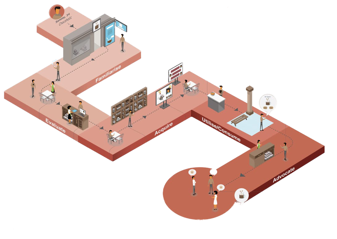
These interactions will tell you about the users' feelings, their motivation at each stage, and the questions they may have along the way.
And the purpose of the travel card is simple: to give the company more knowledge about its customers.
Diary study
The diary study participants keep a diary. There they record their feelings from long-term use of the service or product. They can take screenshots or record video interactions with the site.
Expertise
When testing usability, this stage should be the very first! Before testing, a UX specialist checks your product and its design and determines blind spots.
Though it is not some kind of regulated strict test, it will be based on the experience of a specialist and his view of the problem.
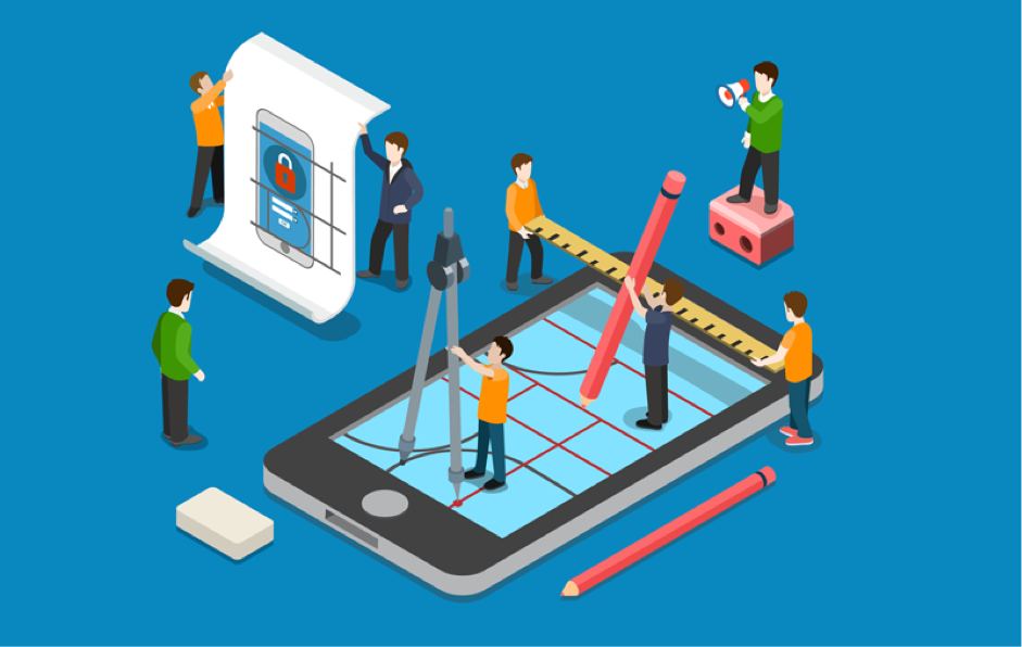
Website wireframe
It is the skeleton of your site's page. It's an easy way to get an opinion from the outside at the "pen-paper" stage. Just draw a wireframe and show it to familiar UX specialists.
Guerrilla testing
It is a cheap and fast way to collect feedback from ordinary people. Tell them the idea or show them the framework of the site. However, consider the difference in mentality. For example, you can just go to some cafe with a website open on a laptop screen and, offering people coffee, ask them to participate in the test.
MVP (Minimum Viable Product)
In development, an MVP is a version of a product when there are enough features to recognize it as working. It can already be used for the purpose for which it was created.
The release of the MVP will help save money on tests, close the main tasks at an early stage and prepare for a full-fledged launch without hassle.
Tree test
It is very similar to card sorting. But here, everything happens in reverse order. The main categories and subcategories have already been created, participants need to find something in them. They click on the links and eventually find the category they were asked to search for.
For example, the task in the test may sound like this: "You are on the hiking store's website. Please find a sleeping bag here."
And then you evaluate the indicators: how long it took to find the right category, the percentage of successful searches, etc.
Workflow
This is a map of the user's movements through the framework or prototype of the site. In general, it is similar to a CJM but does not go into details. For example, this map does not register what a person sees on the screen.