In the second part of the guide on loyalty metrics we have specified the indicators measuring the level of CX. We will tell you why and how to count them and what numbers to achieve.
This article is part of a complete guide on loyalty metrics. Be sure to study other materials from our series:
Metrics of Customer Experience
Unlike the part with business metrics, we did not include the item "How to improve the metrics" in this one. All of the following metrics directly correlate with the customer experience. Improving CX is not a topic for an article but a full-fledged book or a doctoral thesis. In addition, the steps will be unique for each company.
NPS – Net Promoter Score
What it measures: Net Promoter Score is an index of customer loyalty. A metric shows a customer's attitude to your product or website and helps discover how likely they are to recommend you to their friends or relatives.
Why measure: NPS differs from many other loyalty metrics in that it learns the overall impression of a company or brand and not about individual sections of the user path.
Measuring NPS allows you to identify the company's critics and help them solve their problems by increasing the number of promoters.
How to measure: To measure the Net Promoter Score, you need to ask customers: "How likely are you to recommend our business to a friend or colleague?"
Users answer the question with a score on an 11-point scale – from 0 to 10. And one more note: often, when creating such surveys, other types of scales are used, for example, from 1 to 5. But such a metric cannot be considered NPS. Read about other errors when using the metric in the article.
The clients who have rated are divided into groups:
- Detractors (score 0-6) are dissatisfied customers who can bring you to sleepless nights and a couple of hair pulled out. They slow down the brand growth and launch word of mouth with unpleasant details about your site/product.
- Neutrals (score 7-8) are usually satisfied but disinterested customers. They will ignore the offers, and the probability of their return to the site is 50/50. In addition, they can easily switch to competitors.
- Promoters (rating 9-10) are loyal and so satisfied customers they will not only return to the site / buy more but also with a high probability will bring a couple of friends.
Now it is simple to calculate the Net Promoter Score:
The total percentage of detractors – total percentage of promoters = NPS.

For example, 2,000 people took part in your survey. 600 of them (30%) rated from 1 to 6 points, 400 – 7 or 8, and 1000 clients (50%) – 9 or 10. NPS is 50%-30% – 20 points.
Another example. 5,000 clients participated in the survey. 3,500 of them (70%) were detractors, 500 were neutrals, and 1,000 (20%) were promoters. The NPS will be negative since 70% must be subtracted from 20%. That is, the Net Promoter Score, in this case, is equal to -50 points.
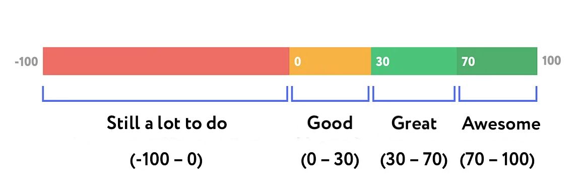
Thus, the NPS can range from -100 to 100. If NPS is -100, all your customers are detractors, and if +100 – they are promoters. However, there are practically no ideal situations. On average, 30 points is already a decent result, and 70 can be considered outstanding.
What is a good indicator: Any business should strive to increase the percentage of promoters. An NPS slightly above zero means that you still have a lot of work to improve customer service, but you are on the right track – your users are more happy than unhappy. If the score is more than 50, you will feel the work of word of mouth. Loyal customers will bring new leads, and your growth rate will increase. When the NPS approaches 75, know that your level is God, and users adore your company!
However, in the real world, it is almost impossible to achieve 75+. In addition, it all depends on the scope of your business. The higher the competition in the industry, the lower the average rating, even for top companies. For example, 0 is good for banking, and 40 is low for Internet service. And the more often a person uses your service or product, the higher are his expectations, and the worse the estimates. And this should also be taken into account when analyzing the Net Promoter Score.
CES – Customer Effort Score
What it measures: This metric determines the relative effort that the user needs to make to perform some actions.
Why measure: your clients want to achieve their goals without effort. The more they are required to make a purchase/subscribe/register, the higher the probability that the client will quit along the way.

According to statistics from The Effortless Experience, 96% of customers who made great efforts cease to be loyal to the company.
How to measure: The best way to measure CES is to ask how difficult it was for the user to achieve his goal (for example, to make a purchase) immediately after acting. The answer is a score on a scale from 1 to 7, where one stands for "Very difficult" and seven is "Very easy." Before, the standard was a five-point scale. But then the company that created the metric was bought by Gartner Group, and they made changes to the original.
Therefore, specialists consider CES differently. Most companies calculate the arithmetic mean of all estimates. For example, on a seven-point scale, 20 people gave 1, 30 - 2, 50 people gave grades from 3 to 6, and 80 respondents gave the highest score. Then CES will be equal to (20*1+30*2+50*3+50*4+50*5+50*6+80*7) / 330 = 4,6.
Gartner advises adding up the number of positive ratings (5-7) and dividing by the number of all ratings. In this case, CES will be represented as a percentage.
Because of such differences in approaches, it is hard to come to a single standard of assessments. There are only a few studies that you can rely on. So, Nicereply considers the average score 5.5/7. If the metric is lower, then your users are experiencing problems.
CSAT – Customer Satisfaction Score
What it measures: CSAT is the metric designed to measure the level of customer happiness. It is probably the most popular metric for evaluating service and product quality in any business area.
Why measure: CSAT is the most popular CX metric for a reason. It combines the capabilities of both NPS and CES. As an NPS, it can measure the overall level of satisfaction with your product and, as a CES, how convenient individual sections of the user path are for the customer.
In the first case, you should interview users with a delay – not immediately after they have performed the target action. Some experts recommend sending a question to respondents quarterly or annually so that you constantly monitor changes in the assessment and notice dangerous trends.
But CSAT works best to get an answer here and now – whether the user is satisfied with the particular scenario: a call to support, a purchase on the site, or the use of a new feature.
How to measure: As a rule, CSAT is based on the question: "How satisfied are you with Company X?/How convenient was it to commit scenario X?" – with a scale from 1 – "Terrible" – to 5 – "Excellent." Specialists often replace numbers with emojis or stars. It does not affect the survey results and sometimes allows you to get more answers due to gamification.
To calculate the percentage of satisfied users, it is necessary to divide the number of satisfied respondents (who gave 4 or 5) by the total number and multiply by 100 percent.
For example, 500 people participated in the survey. 370 respondents gave scores of 4 and 5. CSAT in this case will be equal to (370 / 500) * 100% = 64%.
Yes, please note that CSAT is not the arithmetic mean of all estimates.
What is a good indicator: it is worth focusing on the metric of 76.5%. It is the average CSAT value for American companies. Everything above is worthy, everything below is a reason to take action.
CSI – Customer Satisfaction Index
What it measures: This metric is an improvement on CSAT. In CSI, the overall level of satisfaction with the product consists of the levels of satisfaction with its parameters. For example, the site loading speed or the registration process. These parameters and their number you determine within the company – usually, the main pain points are chosen.
Respondents should evaluate the importance of each of these parameters for them personally.
Why measure: CSI allows you not only to measure the overall satisfaction with the product. It also helps estimate its components or processes. In addition, the parameters that respondents evaluate, as a result, can be decomposed according to the degree of importance. It allows you to prioritize tasks more competently.
And if the CSAT results can still be considered biased due to the flexibility of the method, then this does not apply to CSI.
How to measure: The original metric was formulated by Claes Fornell – he wanted to create a universal satisfaction metric that would be relevant for all industries in Sweden. The experiment turned out to be successful, and as a result, in 1994, Fornell created the American Customer Satisfaction Index (ASCI). It is the organization keeping statistics on CSI in the American economy for 26 years.
The ACSI survey is even more complex than the CSI, but the main point is that satisfaction with the product consists of satisfaction with its parameters. Moreover, the importance of these parameters for respondents also influences the assessment. The classic survey includes two main sections:
• questions to identify the importance of each of the service/product parameters for the client: "How important is this parameter for you? Please rate it on a scale from 1 to 7, where 1 is "Not important at all" and 7 is "Very important"."
• questions to assess the customer satisfaction level with each of the evaluated parameters: "To what extent are you satisfied with this parameter? Please rate it on a scale from 1 to 7, where 1 is “Not satisfied at all" and 7 is “Completely satisfied"."
The classic scale used is from 1 to 7, but you can also use the 1-5 system. The results will be no less valid, and the counting principle is the same.
What is a good value: according to the latest data from the American Customer Satisfaction Index, the values in various industries are as follows:
Automobile – 82%;
Banks: 81%;
Soft – 79%;
Hotels – 76%;
Online retail - 80%;
Insurance – 80%.

NPS vs. CSAT vs. CES – which is better?
This trio of metrics is the most popular in the world of CX. The vast majority of companies use it to measure customer experience. However, each of them has its strengths and weaknesses. So which metric should you choose? We'll analyze each in more detail.
ADVANTAGES OF NPS
+ It segments out your customers really well. And then, you clearly understand which groups you need to focus on (promoters, neutrals, or detractors) to get the best results. By tracking the ratio of critics and promoters, you will receive insights into whether you are building long-term relationships with customers correctly or not.
+ As a rule, it gives accurate results. The classic NPS question allows you to get unbiased answers about products and services. Instead of focusing on specific sections of the user path, NPS finds out the attitude towards the company as a whole.
+ NPS evaluates long-term relationships. If the client is not ready to recommend your company, he does not trust you. If he does, he is more loyal and able to bring new customers.
+ NPS, as a rule, converts well into a response. On average, 20-40% of possible respondents participate in such a survey. So that, even on a small sample, NPS can give you many insights.
DISADVANTAGES OF NPS
– In most cases, the NPS results are not as useful without additional open-ended questions. Relying only on high ratings, top management can start thinking that everything is fine with the company. But this is not always the case.
ADVANTAGES OF CES
+ The strongest argument for CES is that, according to HBR research, its results are exceptional at predicting the possibility of future purchases. 94% of respondents who had spent little effort to act then made repurchases.
+ At the same time, another study shows that 81% of respondents who spent a lot of effort on buying would tell their friends negatively about the company. So CES also allows you to understand how customers advertise the brand to others. The easier it is for them to perform actions, the more likely they will recommend you to friends.
+ Since CES focuses on specific interactions, it will help determine which ones require immediate intervention and fixes.
DISADVANTAGES OF CES
– One of the main problems of CES is that the metric does not allow any segmentation of customers. You will not be able to figure out which group the user who is having problems belongs to. And what kind of relationship you have. Therefore, CES is often used only in conjunction with NPS.
– With the help of CES, you will not be able to determine why some interaction causes difficulties for customers. For example, the respondent could answer that it was not easy for him because he wanted something from you that your company does not offer. The result of CES will show that he has a problem interacting with the product, but this information will be useless to you. And the answers may also be influenced by the prices and offers of competitors.
ADVANTAGES OF CSAT
+ CSAT can be the most flexible metric, and it is its significant advantage. You can easily customize the questions to analyze the strengths and weaknesses of the company. In addition, the scale can also be completely different – both in digital (1-5, 1-7, 1-10) and in visual (icons, emojis, and so on) equivalents.
+ Speaking of flexibility, the number of questions also varies. You can make both a giant questionnaire and limit yourself to one question. It all depends on the goals and objectives.
DISADVANTAGES OF CSAT
– CSAT allows you to know the emotion only at this moment. It is often even a plus, but in the context of loyalty and long-term relationships, it makes the answers less relevant to you.
– The answers are not always objective because satisfaction is different for each user. There is an interesting study by Psychological Science. People from more individualistic countries (such as the USA) usually choose more extreme answers at the edges of the scale. While people from collectivist countries (for example, Japan) tend to be at the center of the scale in their answers.
– Some customers don't want to offend your brand with low ratings, even if they think so. In addition, some disinterested users who do not want to take the survey will give you average, neutral ratings.
– The last problem is that CSAT will not help you measure loyalty. At best, the number of low ratings will help you predict the churn rate. But high ratings do not mean the customer will return for a repeat purchase. You can only guess.

Usability metrics and questionnaires
Separately, we would like to highlight the usability and UX metrics. They are more difficult to relate directly to loyalty, but they affect the customer experience. It means they can predict the probability of churn and retention of users.
There will be not only metrics but also full-fledged sets of questions. They are ready-made methodology questionnaires that have passed the test of time and can bring a lot of insights.
SEQ – Single Ease Question
What it measures: This metric refers to CES – we return to the effort spent on completing the task. It is usually used in usability tests to understand how easily the user completed a particular task.
Why measure: SEQ is practically no different from CES – you ask how easy it was to complete some task. The only difference is that CES is about a global goal, and SEQ is about specific steps towards its implementation. But in fact, no one prevents you from interchanging these concepts and calling everything by one common abbreviation.
How to measure: Just like CES – 7-point scale from 1 to 7 and arithmetic mean scores.
What is a good indicator: 5.5 out of 7.
SUS – System Usability Scale
What it measures: SUS is a questionnaire designed to assess the overall usability of your product. It consists of 10 questions about how convenient it is for the user to use the site/application. Often, due to the complexity of the survey for respondents, it is conducted only during usability tests.
Why measure: this is not the easiest way for the client to tell how comfortable he is. Not everyone will be able to master ten questions. But they are formulated in such a way as to get the most objective picture in the context.
How to measure:
To begin with, give respondents ten statements. They rate each on a scale of 1 (Strongly disagree) to 5 (Strongly agree). Odd numbers are positive, and even numbers are negative:
- I would like to use this system frequently.
- I found the system unnecessarily complex.
- I thought the system was easy to use.
- I would need the support of a technical person to be able to use this system.
- I found the various functions in this system were well integrated.
- I thought there was too much inconsistency in this system.
- I would imagine that most people would learn to use this system quickly.
- I found the system very difficult to use.
- I felt very confident using the system.
- I needed to learn many things before I could get going with this system.
To calculate the final score, you need:
- For odd questions: subtract one from their score;
- For even-numbered questions: subtract their score from five (you will obtain values from 0 to 4 for each question);
- Add up all ten values;
- Multiply the sum by 2.5 (you will obtain a value from 0 to 100).
- Calculate the arithmetic mean among all the respondents' SUS values.
What is a good value:
The average SUS score is 68, not 50, as it might seem. It is noteworthy that the SUS score correlates perfectly with the NPS.
UMUX – Usability Metric for User Experience
What it measures: This metric was created by Kraig Finstad as an alternative to the complicated SUS to evaluate the functionality and ease of use of the product.
Why measure: UMUX, like SUS, is a fit for usability tests, but because of its compactness, it is the best alternative for use from scratch – on a website or in an application.
The standard UMUX consists of 4 statements that respondents need to evaluate on a scale of 1 (Strongly disagree) up to 7 (Strongly agree):
- This website/ product/ tool/ software/ prototype capabilities meet my requirements.
- Using this website/ product/ tool/ software/ prototype is a frustrating experience.
- This website/ product/ tool/ software/ prototype is easy to use.
- I have to spend too much time correcting things with this website/ product/ tool/ software/ prototype.
There is also a shortened version – UMUX-Lite, consisting of 2 statements:
- This website/ product/ tool/ software/ prototype capabilities meet my requirements.
- This website/ product/ tool/ software/ prototype is easy to use.
Moreover, UMUX-Lite can replace SUS without losing the quality of the evaluation!
SUPR-Q – Standardized Usability Percentile Rank Questionnaire
What it measures: SUPR-Q was created in 2015 by Jeff Sauro from measuringU. It is a comprehensive metric for measuring the user experience of a website or applications in general. It consists of 8 questions covering four different zones: usability, credibility, loyalty, and appearance.
Why measure: Like most usability questionnaires, SUPR-Q is not designed to diagnose specific problems with UX or CX. Instead, it helps to evaluate the usability and reliability of the product in the eyes of the user. It is a valuable tool for analyzing websites, although you can also use it in applications.
How to measure: Users are asked to rate seven statements from 4 groups on a scale of 1 (Strongly disagree) to 5 (Strongly agree). The 8th question at the same time is a standard NPS with a scale from 0 to 10:
Usability
- The website is easy to use.
- It is easy to navigate within the website.
Credibility
- The information on the website is credible. (E-commerce variation: I feel comfortable purchasing from the website.)
- The information on the website is trustworthy. (E-commerce variation: I feel confident conducting business on the website.)
Appearance
- I find the website to be attractive.
- The website has a clean and simple presentation.
Loyalty
- I will likely return to the website in the future.
- How likely are you to recommend the website to a friend or colleague? (NPS)
If you are already conducting a separate NPS survey, you may not include the last question in the questionnaire.
To calculate the SUPR-Q, you need to calculate the arithmetic mean of the answers to all the questions. At the same time, the NPS indicator is divided by 2 to equalize the scales. The SUPR-Q is also calculated for each of the groups (Usability, Credibility, Loyalty, and Appearance). Quarterly measurements allow you to control the trend and prevent drawdowns of the customer experience.
UEQ – User Experience Questionnaire
What it measures: another comprehensive customer experience questionnaire, created in Germany in 2005, consists of 6 scales:
- Attractiveness: Overall impression of the product. Do users like or dislike the product?
- Perspicuity: Is it easy to get familiar with the product? Is it easy to learn how to use the product?
- Efficiency: Can users solve their tasks without unnecessary effort?
- Dependability: Does the user feel in control of the interaction?
- Stimulation: Is it exciting and motivating to use the product?
- Novelty: Is the product innovative and creative? Does the product catch the interest of users?
The classic UEQ questionnaire consists of 26 questions – 4 in each of the sections (6 in Attractiveness).
Why measure: firstly, the authors of the questionnaire conducted more than one study in which they proved that their solution allows you to accurately assess the strengths and weaknesses of a company's CX. In addition, you can use UEQ results to compare two versions of the product.
How to measure: you give your respondents 26 pairs of product definitions in random order. They need to express their attitude using a seven-point scale from -3 to 3, where the extreme values are the very opposite definitions. The whole list looks like this:
- Attractiveness:
- annoying / enjoyable, good / bad, unlikable / pleasing, unpleasant / pleasant, attractive / unattractive, friendly / unfriendly
- Efficiency:
- fast / slow, inefficient / efficient, impractical / practical, organized / cluttered
- Perspicuity:
not understandable / understandable, easy to learn / difficult to learn, complicated / easy, clear / confusing
- Dependability:
unpredictable / predictable, obstructive / supportive, secure / not secure, meets expectations / does not meet expectations
- Stimulation: valuable / inferior, boring / exciting, not interesting / interesting, motivating / demotivating
- Novelty: creative / dull, inventive / conventional, usual / leading-edge, conservative / innovative
To minimize thoughtless responses, the distribution inside the pairs is also random. Half of the positive statements should be on the right edge of the scale, and half – on the left.
As a result, first, you should calculate the arithmetic mean in each category for each respondent. And then between all of them. For example, in the Stimulation category, the average score maybe 1.3, and in Reliability -2.7, etc.
What is a good value: the creators of the metric provide such a table of average numbers: