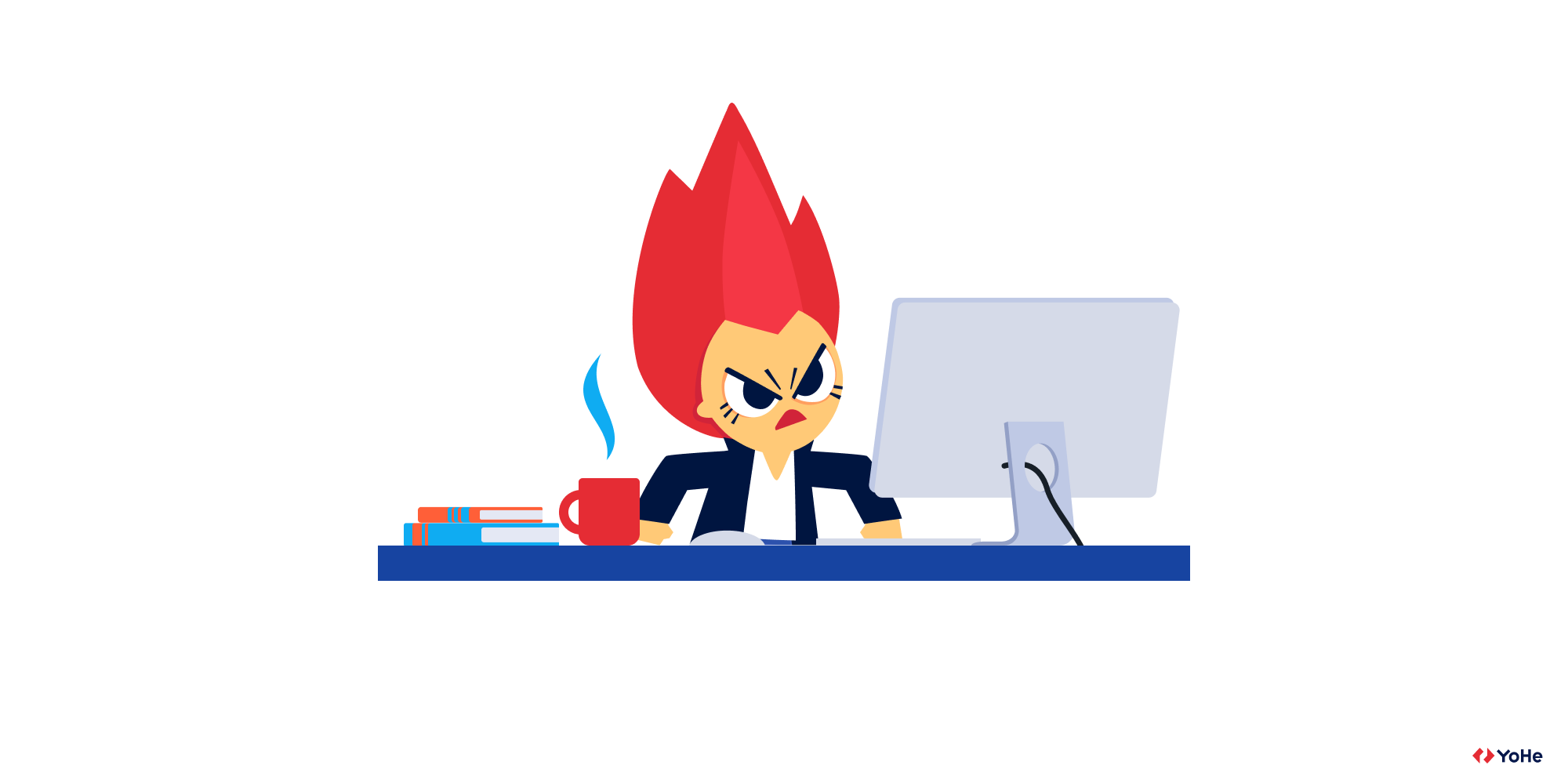
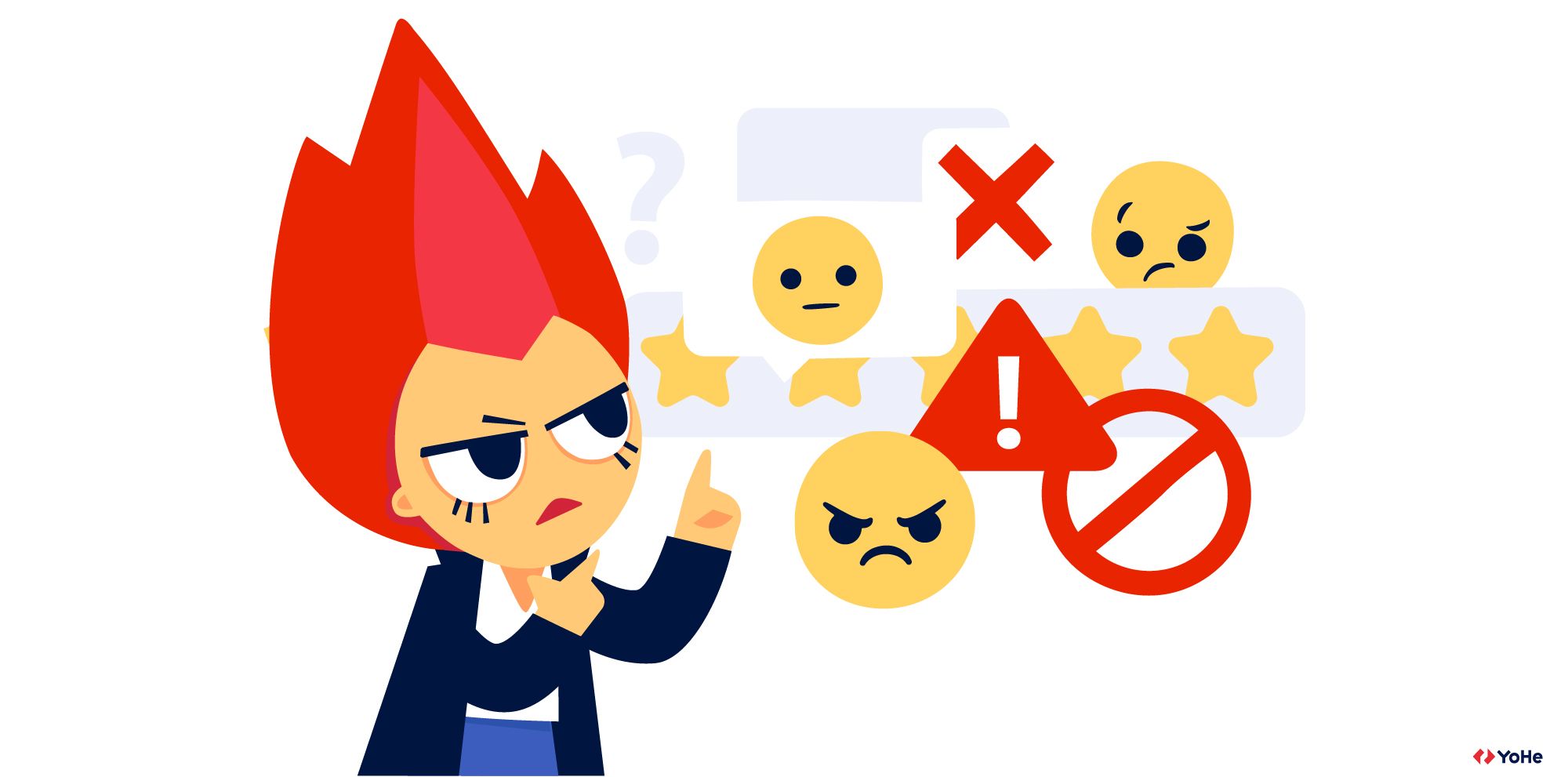
"We collected lots of feedback and did everything they asked us, but still they are unhappy!". Does this sound familiar to you? In this article we would like to talk about the most frustrating feedback-related problem: "We collected it. Now what?". It is so hard to convert customer wants into needs, but there is always a solution. So let's see what we can do about it.
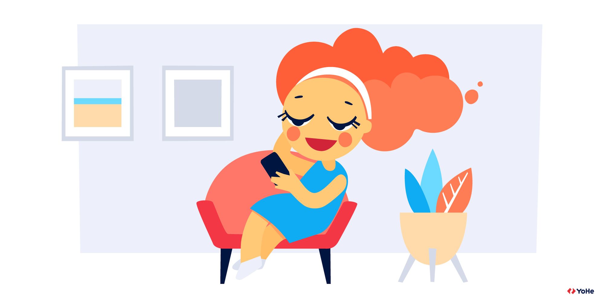
The Voice of the Customer concept is one of those things that seems very simple at first glance. “I'm going to get all the feedback in the world and make my customers super happy!”. That's what some people think. But after the feedback is collected, companies are faced with the fact that the information received doesn't work just like that. It is necessary to do something else to make this feedback useful. And these actions can be globally divided into four stages: collection, data processing, research and solution.
In this article, we will focus on the second stage, since this is where two of the most important concepts of Voice of the Customer appear: wants and needs of your customers.
I don't see the difference
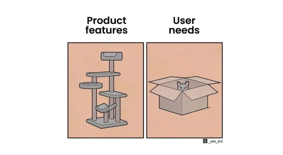
The main problem with these two terms is the lack of clear definition. So the concepts often overlap, leading companies off the right path before they can actually solve certain problems. However, it is not so difficult to separate one from another. Let's have a look at an example.
The user leaves a comment: "Make this button red!". At the same time, other users are trying to tell you how good it would be if the same button was "green", "blue", "purple". And often in companies, this starts the wrong process: “Which button to choose?”. It is clear that the example is very simplified, but based on it it is very easy to research the problem.
It is important to understand that users care just about their problem. For example, it seems to them that the button should be red and then everything will be fine. At the same time another person is confident that it should be green and so on. But the task of any specialist is to get to the bottom of the problem and see what these cases have in common. What is the global reason for all this fuss around a single button? Is it just the color? And if so, why?
What if the user simply can't find the right button? It turns out that the color has nothing to do with it. It's just that the client can't navigate the site normally. With that being said, you can separate the need from the simple “Wishlist”. The need here is to quickly find the desired feature. And a want is a person’s solution to his need without being tied to the rest.
In our practice, there was also an example when a client asked that any click on a rating emoticon would be instantly sent to a personal account. At that moment, it was impossible to leave an assessment without a text, and he wanted to get as many marks as possible at any cost. But users often can't decide which emoji to choose right away and click on several in turn before submitting their feedback. But this deforms the statistics.
Therefore, having realized the need of the client, we fulfilled it, but not his initial want. In our tools it became possible to choose just a mark, without leaving any comments. As a result, the client was happy, and many other companies began to use the new feature.
To summarize it: a want is how the client sees the solution to his problem. Naturally, he ignores many factors that can affect the work of other people / companies. At the same time, a want can be different for everyone, and almost everyone has the same needs.
How to figure it out?
Let's say you did some qualitative research and figured out what users need. But somewhere in the background you have a doubt: “Do my clients really need this? Did I understand them correctly?"
Instead of guessing it is better to check. Take the need you identified from your earlier research and look a little deeper into it. An example will help us again.
Let's imagine you have a video platform with different movies. You are asking your users what they want to do first before they subscribe to your service and they say that it would be great to see what kind of movies you have there. That's right! They need a catalog they can browse through!
But let's not jump to conclusions that quickly. It might not be what they really need. It's better to conduct some A/B tests first and then have a look at the results. It might appear that your users already know what they want to watch and having a catalog doesn't affect their determination to subscribe to your service.
Yes, finding the real need takes time, but it is worth it. It will bring you more profit than several quick decisions based on your assumptions.
A bit of practice
Theory is always better with practice. Therefore, in this part, we will analyze several examples of feedback and highlight the very needs of users from the flow of indignation.
"I was at the "Chocolate" section and wanted to get quickly to "Cakes". Usually you can see some structure like Sweets/Chocolate, you just click on "Sweets" and get back to the section. But on your website it was impossible to do so. I couldn't find it anywhere"
At first glance, it may seem that the problem is related to a specific section with sweets and the user wants to be able to quickly select a cake. But this is just one of the markers that the site has a global navigation problem and users cannot easily move from one category to another. It turns out that the need in this case will be more understandable navigation.
"I clicked five times the "Purchase" button and nothing happened! I wanted the express delivery, but it looks like it is faster to go shopping offline"
And here the user is unable to arrange express delivery, but it is not necessary to focus on it. There is even a hint in the comment that something is wrong with the site as a whole all the time. The need here is speed. Everything should work very fast! From website to delivery. The user needs express delivery, but it turns out that the trip to the real store will be faster. Time is the most valuable resource. And those people who need "express" are a special type of customers. They are ready to forgive a lot, but not problems with speed.
"I cannot find the "Penthouse" tab. I don't want to go through all of the accommodation types, I just want to see the penthouses. It is not complicated to make a separate tab, seriously. This website just makes me totally frustrated"
This story has something in common with the first case. Again, it's not about the actual penthouse, it's about complex navigation in general. The need is to find only what is needed and not to waste time on going through the huge catalogs. There is also an intersection with the time that we spend on achieving the goal.
"I don't want to look at 1000 offers and then look for them on the map. Please, make it possible to search all of the houses on the map. Just make a button on every page so users can change to the map search at any time"
This comment is an example of a specific suggestion from a user: "Make a button on every page." We do not know the context, but it is with such feedback that one must be especially careful. The user showed the solution, but also revealed the need. The need here is not only to look only at the right information (for him), but also to quickly find what meets certain criteria.
But how to do it right - add a button or something else, this is another question. This needs to be discussed additionally with UX designers.
"Please, upload the pictures in all colors and make an online project so one can check how the object looks in the room"
When choosing furniture, the buyer needs to select it for their apartment design. For a certain project,
And there are many possible ways. The main thing to remember is that the simplest solutions are the most effective. Our advice: do not run to make the most complicated constructor. Perhaps it will be enough to integrate with existing popular software or simply place your products in examples of different layouts. But it’s worth starting with simple things.