You can improve the application with the help of user feedback and, at the same time, minimize the negativity in the stores. No magic – in this article, we will tell you how to kill two birds with one stone: get insights and improve app rating.
The mobile app market is one of the fastest-growing in digital. By 2026 it is expected to grow fourfold. Users are rapidly changing their digital habits, and they need tons of new applications for each one.
Downloads (+45% since 2016, 218 billion in 2020) and usage time (+20% compared to 2019, 4 hours 10 minutes a day) are growing. And mobile games have been bringing developers more money than all other platforms combined for the fourth year in a row (in 2021, total user spending for the year exceeded $ 120 billion).
However, along with the demand, competition is also growing. We can tell it by looking at the desktop products. On websites, inconvenient UX, bugs, or low speed negatively affect the user experience – every third customer will refuse the services of their favorite company after the first unsuccessful experience. And 92% will leave after 2 or 3 failures.
In the application, everything is even more complicated. Unsuccessful solutions will not even allow you to interact with these users. They will see a low rating in the store and choose something better.
Ratings in stores – three in one
The number of ratings is growing even faster than the indicators from the beginning of the article. Stores have been simplifying the rating system and providing developers with an API for evaluation right inside the application. If the user puts a rating, it immediately flies to the store.
At the same time, reviews in app stores are both a business metric, a source of insights, and a marketing tool.

Marketing
The rating directly affects the "attractiveness" of the application. Half of the users will not download an application with a four-star rating or fewer, 80% of users – with a rating of less than three.
Moreover, the rating also affects the brand's reputation as a whole. 55% of users begin to be wary or negative about a well-known company if the rating of its application does not reach three stars. And vice versa – 71% admit that 4- or 5-star ratings incline them to a positive attitude.
Business metrics
For those who put conversion at the forefront, we also have statistics. Increasing the app rating from three stars to four, on average, increases the conversion rate by 89%, from two to three – by 280%.
Insights
Users not only frantically put ratings but also write helpful reviews that make the app better.
To summarize: the market is growing, and users choose the applications more carefully. Which directly affects attractiveness and conversion. And now the question is: how to improve the application without killing its rating in the store, and at the same time keep a useful flow of information from users? There is a solution – to collect feedback right inside the product.
Why collect feedback in the app
Above, we mentioned that now you can put ratings in App Store and Google Play directly from the application. And even though the number of ratings in stores has increased, there are no more constructive comments at the same time.
Generally users don't write reviews just because they feel like it. If you don't launch a trigger with an offer to evaluate the application, they will go to the store only in two opposite situations. Being furious or having just experienced a unique (and, at the same time, positive) user experience. Asking to leave a review in the store for some benefits is now also impossible - both Google Play and the App Store have recently prohibited manipulating ratings or influencing them.
But it is the feedback that is an opportunity to improve the application based on the real needs of users, and not just on the team's ideas.
Plus, in such comments, they write not only about bugs. For some reason, it is believed that the feedback in the stores was created to immediately send it to developers. If you ask the user the right question in time, they will tell you about the not debugged business processes, the attitude to the brand as a whole, and what shortcomings hinder them the most.
Feedback from the app helps:
- identify issues and generate ideas for new features
- get approval for them from users
- prioritize the product roadmap
- collect insights about the UX of the application
- understand how your application is used to catch dissatisfied users, prevent churn, and improve retention
- identify loyal users and increase the number of 5-star ratings
- optimize monetization and pricing policy
- improve conversion
- conduct pre-release marketing research
- let users know that their feedback is important to you
The main strength of the feedback in the application is that you get it in the moment. The user encounters a barrier and immediately, with all the details, describes what went wrong. At the same time, they do not negatively affect the ratings in the store, since it has already poured out its soul.

How to collect feedback in a mobile app
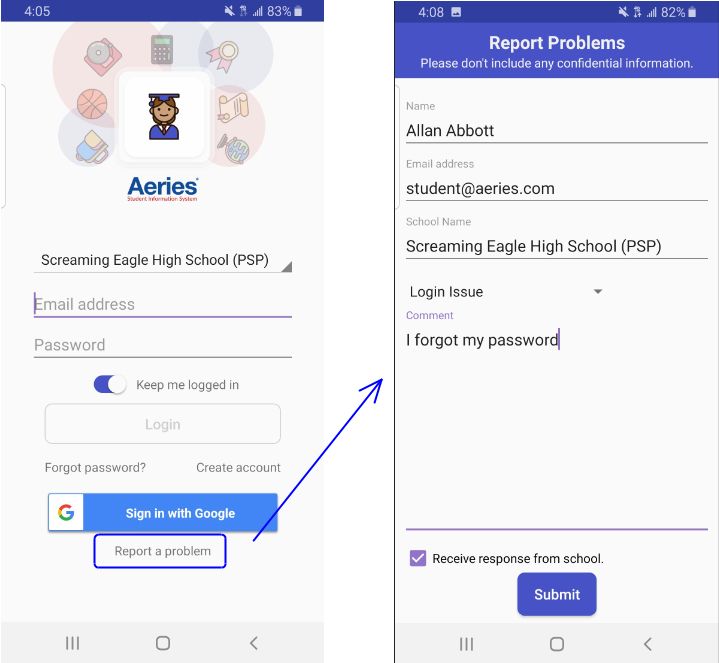
There are all kinds of platforms for working with feedback inside the application, but even without them, a banal feedback form can help you to receive insights or error messages. Look, for example, at such a solution:

You can hide that type of link in the hamburger menu. Another solution that we also actively use in our projects is to call the feedback form when shaking the device. Such interaction, for example, can be found in the Facebook app.
The main principle is that the user gets the opportunity to write right here and now about what he cares about. Such feedback is called passive, and it will help you to protect yourself from some of the bad ratings.
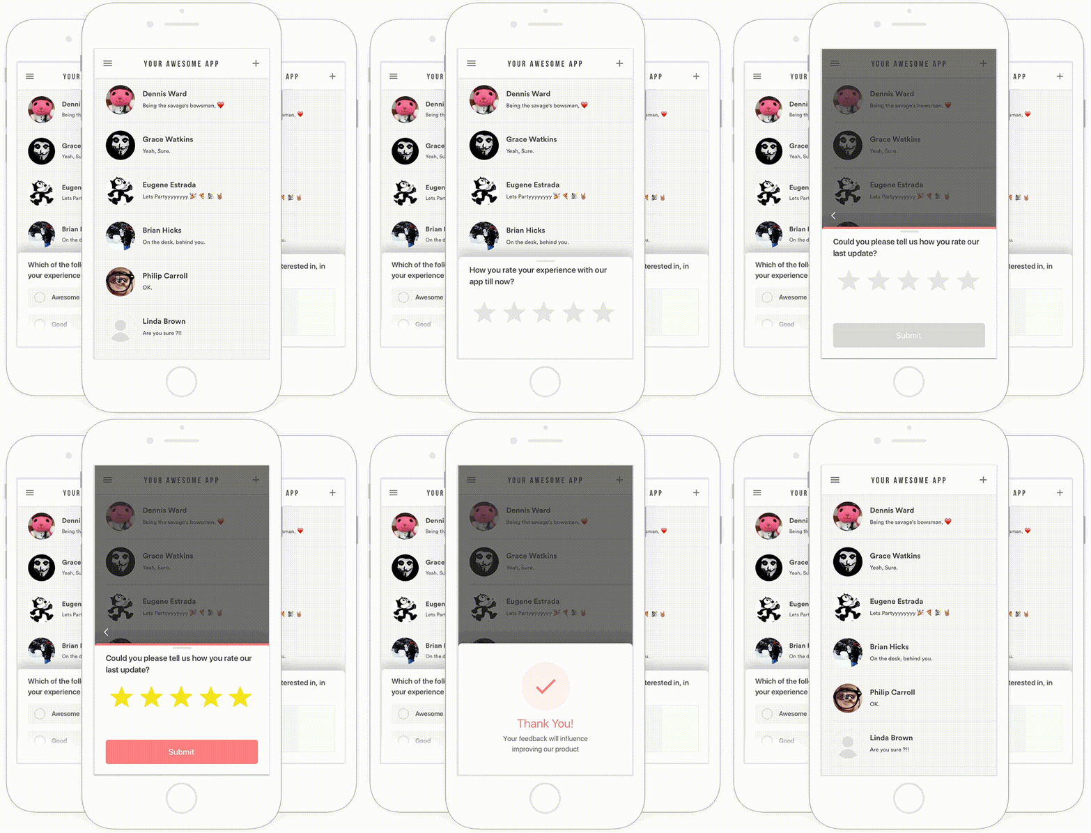
Active feedback is when you initiate a dialogue yourself. The forms that appear on the screen with a question are a super useful tool. But in unexperienced hands, they turn into a weapon of mass destruction.
Forms that appear at the wrong moment, a huge number of fields, while the question has nothing to do with the actual user experience… To help you avoid such mistakes, several recommendations will make working with feedback as painless as possible for users and as effective as possible for you:
The right moment
Remember that feedback from the user is a favor. Therefore, the question should be asked in the right place at the right time. The perfect moment is success screens.
The user has just completed a key action and is satisfied: a closed goal in the to-do list, an exercise completed, a movie watched. He will be much more motivated to share feedback or evaluate the application in the store.
It is important to be in the context of the user's path and not to distract him with standard questions about everything at any given time. Be more creative and find the very moments when you need to ask.
Brevity is the soul of wit
The app is not the best place for 10–page questionnaires. Ask a maximum of 1-2 point questions to increase the conversion rate in response. Whenever possible, replace the text with pictures or emojis.
Emoji can be used as an answer to the first question – gamification works great and involves more respondents.
The next question may be more open and deeper so that the user can write a detailed comment. And if you ask the respondent to leave contact details, you will show him the importance of his opinion and readiness for dialogue.
Don't push
Users don't owe you anything. Therefore, do not spam them with endless pop-ups. This is what the stores themselves strive for. Apple, for example, has limited the number of evaluation requests from a specific user to three per year.
In addition, users who do not want to leave feedback should be able to close the annoying tab and return to their actions.
Pop-ups are not a panacea
And it's not the only way to collect feedback. It can generally be done using UI elements. Have you ever wondered how streaming services improve the music selection system? In Spotify, for example, a user can rate how much a song from a selection matches his taste by clicking on a heart icon. The choice affects not only various machine learning algorithms but is also the easiest way for developers to understand the whole picture.
Don't limit users to "Yes"/"No" answers
Often a simple "Yes"/"No" will give you all the information you need. But not always. Open questions will allow users to share with you their pains. At the same time, don't expect long poems from them. Writing long texts on a smartphone is still not much fun.

Which questions to ask
Before launching surveys, it is crucial to identify several reference points:
The purpose of the study.
This item may seem obvious to someone, but people often forget it! Formulate what and why you want to learn from users. Imagine how you could answer your questions yourself – would you be able to give such answers that would help with the research?
Open-ended or closed-ended questions.
Open-ended questions help a lot with high-quality feedback. It is a great way to dig deep into a defined area. The most important thing is that even on a small sample it will give you cool insights. But there is always a risk of generalizing the question too much. In addition, respondents need to spend precious time answering. So it's better not to overdo it with open-ended questions.
Closed-ended questions help collect quantitative feedback and answer the tasks you have set. This data shows the overall picture, trends, and patterns in the use of your application. The respondent spends less time and effort on such an answer.
At the same time, the best, most effective surveys, as a rule, are somewhere in the middle. We strongly recommend that after each closed-ended question (for example, "How satisfied are you with the ease of use of the app?") you ask an open-ended question. Ask why the respondent gave this particular rating / chose this option.
Below is a list of the most valuable questions that you can ask in the mobile application:
Product feedback
- What problem/goal do you want to solve/accomplish using this app? (text response)
- How much did the app help you solve the problem/fulfill the goal? (scale from 1 to 5)
- What would motivate you to use this app? Why? (text response)
- Which feature of the app is most/least valuable to you? (multiple choice)
- Describe how you would feel if you couldn't use this app anymore? (text response)
- Which features didn't work as expected? (text response)
- Were there any features that you expected to find but didn't find? (text response)
- What features would you like to add to the app? (text response or multiple choice for further prioritization)
- How satisfied are you with the stability of the application? (scale from 1 to 5)
- How satisfied are you with the security of the application? (scale from 1 to 5)
- How satisfied are you with the possibilities of integrating our application with other services? (scale from 1 to 5)
User Experience
- How convenient is it to use our app? (scale from 1 to 5)
- What was your first impression of the app? (text response)
- How satisfied are you with the process of installing the application/getting to know the application (onboarding)? (scale from 1 to 5)
- Does something confuse you when working with our application? (text response)
Market Research
- What price are you willing to pay for this app? (multiple choice)
- How clear is the pricing of our application for you? (text response)
- What alternatives to our application are you considering? (text response)
- How would you rate our app compared to competitors? (scale from 1 to 5)
- How did you find out about the app? (text response or multiple choice)
- Support
- How would you rate the level of support in our app? (scale from 1 to 5)
- Have we been able to solve your problem/answer your question? (yes or no)
- How long did it take us to solve your problem? (scale from 1 to 5)
- What types of support do you prefer? (multiple choice)
Beta test
- Overall, how would you rate the beta version? (scale from 1 to 5)
- How easy was it to report the problems you encountered? (scale from 1 to 5)
- Do you have any comments/suggestions about the beta test? (text response)
General feedback
- How would you rate the quality of our app as a whole? (scale from 1 to 5)
- How likely is it that you would recommend our app to friends or colleagues? (NPS)
- Do you have any additional comments/suggestions? (text response).

How to increase the rating of the application using feedback
By following the recommendations and using the questions from the list above, you will not infuriate users and will find out about all of their problems. You will also gradually raise your rating – after all, you will start listening to the Voice of the Customer and improving the application.
However, many users will still keep the habit of going to the store and spoil your app's karma. There is a proven technique to avoid it. You will find out about all the product problems, and quickly raise the rating of the application. Let's analyze this scheme in more detail.
A user who has already passed onboarding and lived in the application (this is usually 72 hours and at least three visits) is shown a form with the question: "Do you like our application/company?" And then, two scenarios are possible.
If the "Yes" option is selected, then it is suggested to evaluate the application in the store and, if desired, leave a review. If "No" – to take a small survey and, if necessary, contact the support chat. What happens as a result – dissatisfied users stay right here and can quickly solve their problems with support. Satisfied users increase the rating of the application. You get insights, purify karma and improve ratings.
But here, of course, there will also be buts. Such patterns will not always work. It all depends on the specifics of the application, the audience, and its loyalty. And if your app is frankly bad, it will not save it from rating punishment.
And the pop-ups are frustrating, and there is no hiding from it. Have you cursed developers for being distracted from playing, watching content, or ordering goods? Targeting solves this problem. With the help of analytics and experiments, there are those ideal moments when you will not disturb the user's peace. For example, at the end of a level or after a successful purchase.
There is also a slightly different implementation.
It is especially suitable for content applications whose UI is focused on scrolling. The only difference from the scheme mentioned above is that the block with the question does not pop up, but is embedded directly into the feed or content.
Unlike a pop-up form, such a solution does not require additional interactions. The user will scroll through it if he does not want to answer the question. The traditional but – this way, you will get much fewer ratings.
Conclusion
Mobile feedback is not a substitute for ratings and reviews in app stores. In a perfect world, they should work hand in hand. In this synthesis, an evaluation will continue to play a marketing role, and feedback will receive insights and reduce negativity in stores. Thus, you will have more chances to make the application the way your users would like it to be.


